Why Nobody Buys in a Vacuum: Anchoring, Decoy Options and the Tier Ladder That Sells the Middle
A price tag is a small piece of theatre with a real number in the middle of it.
A price looks like a fact. It behaves like a comparison. Nobody knows what sixty dollars means until something else on the same shelf costs a hundred and twenty, or used to.
That is the entire mechanism, and you cannot opt out of it. The mind has no absolute scale for value, so it borrows one from whatever is standing nearby. The people who design price tags know this. They do not so much set a number as furnish the room around it.
For twenty years that room was private craft. In 2026 it became auditable. Poland’s competition authority issued its first fines for discount labelling in January. American courts kept certifying class actions over crossed-out prices that never existed. A peer-reviewed study found that the European rule forcing retailers to disclose the real 30-day low makes shoppers less willing to buy. The architecture still works. The fiction wrapped around it now carries a price of its own.
So this is a piece about three devices — the anchor, the decoy, the tier — and about the line between designing a comparison and inventing one. If you sell anything with a price attached, all three are already running inside your business. The only question is whether you drew them on purpose.
The number is never the price
Start with the oldest demonstration in behavioural economics, because it is still the cleanest.
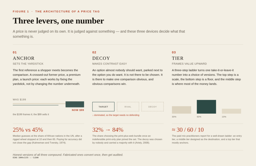
In 1974, Kahneman and Tversky spun a rigged wheel of fortune in front of their subjects and asked them to estimate how many African countries belonged to the United Nations. One group saw the wheel stop at 10. Another saw 65. The median guesses came back at 25 percent and 45 percent. The wheel knew nothing, and the estimates moved anyway. When the researchers paid people for accuracy, the gap did not close — a useful warning for anyone who assumes a motivated buyer is an immune one.
Anchoring is not a quirk of the uninformed, either. In a 2003 Quarterly Journal of Economics paper with the best title in the field — Coherent Arbitrariness — Ariely, Loewenstein and Prelec asked people to write down the last two digits of their social security number, then to name prices for ordinary goods. Higher digits, higher willingness to pay. What made the result unnerving was the coherence: the numbers moved, but they moved together, scaling neatly with quality. The arbitrariness was invisible from the inside.
That is the part that should interest you as a marketer. A badly anchored customer does not feel anchored. They feel decisive.
Lever one: the anchor
What an anchor is actually doing
Anchors do two jobs, and most pricing pages confuse them. The first is to set the range — this category costs somewhere between X and Y. The second is to set the direction — the thing worth looking at is here. A crossed-out price does the first. A premium option does the second. Pages that try to do both with a single number usually do neither.
The last centimetre of the number matters too. Thomas and Morwitz showed in 2005 that $2.99 reads as materially cheaper than $3.00, but only when the leftmost digit changes. Set $3.59 against $3.60 and nothing happens, because your eye has already filed both under three. The effect is real, narrow, and easy to fake badly.
The crossed-out price became a legal document
Europe moved first. Under the Price Indication Directive as amended by the Omnibus Directive, an advertised reduction has to sit next to the lowest price charged in the previous thirty days — in every channel where the reduction appears, from the listing page to the checkout. Poland’s regulator, UOKiK, has been the sharpest enforcer. In January 2026 it issued its first fines under the rule, roughly 31 million zloty against Zalando and about 5.9 million against Temu — call it 7.1 and 1.35 million euros — with a statutory ceiling of 10 percent of annual turnover. Detailed reasoning was still pending. The signal was not.
In April it opened proceedings against three more retailers, including a furniture chain where the promotional tag read 989 zloty against a crossed-out 1,439, while the genuine 30-day low had been 899. The crossed-out number was real. It was also beside the point, which is exactly the sort of detail regulators enjoy.
The behavioural research suggests the rule bites harder than retailers expect. A 2026 study in the Journal of Consumer Policy tested what happens when shoppers see the mandatory 30-day reference: purchase intentions fell, most sharply for everyday functional goods like appliances, and the effect appeared regardless of how closely people normally track money. An honest anchor, in other words, is not neutral. Sometimes it argues against the sale.
The American version is older and vaguer. The FTC’s Guides Against Deceptive Pricing, 16 CFR 233.1, require a former price to be one the product was genuinely offered at, in good faith, for a reasonably substantial period. Several states turn that into arithmetic: 28 days out of the past 90. Vagueness has been expensive anyway. Boohoo reportedly settled comparison-pricing claims for 197 million dollars. Michael Kors put up a 4.9 million dollar fund plus fees. Oregon’s Supreme Court let an Eddie Bauer shopper proceed on the reasoning that a discount off a price that never existed still counts as a loss.
Anchors you can defend
None of this rules out anchoring. It rules out inventing. Four anchors survive an audit.
A premium tier you will actually sell. Not a paper plan — a real one with real customers, even if only a handful. Its job is to set the ceiling, and a ceiling nobody can reach is not a ceiling, it is a rumour.
Your own price history, disclosed honestly. Seasonal swings, input-cost moves, a short promotional window: all of it can be shown without fiction, and the 30-day rule rewards exactly that.
Component math on a bundle. Showing the sum of the parts is an anchor built out of facts, which is why it keeps working after the auditors leave.
Launch high, descend once. A premium launch that later settles at a lower price frames the lower price as a reward. A price that keeps sliding teaches the customer to wait, and waiting is the most expensive behaviour you can teach.
Lever two: the decoy
The page that should not have worked
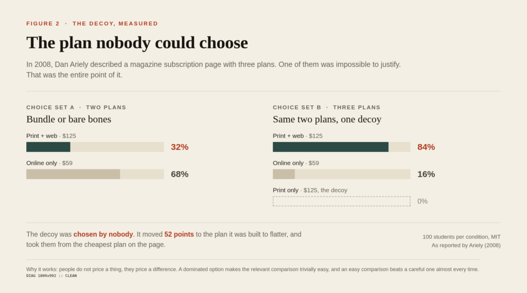
Three plans: web only at $59; print only at $125; print and web at $125. The middle option was absurd. Nobody sane buys print alone when print and web cost the same money.
Dan Ariely ran it past MIT students. Sixteen percent took web only, 84 percent took the bundle, nobody took print only. Then he removed the absurd option and ran it again. The bundle fell to 32 percent. Web only jumped to 68 percent.
The option nobody chose had been doing 52 points of work. It earned nothing directly and carried a majority indirectly, which is the whole reason decoys exist.
Why contrast beats calculation
Huber, Payne and Puto documented the mechanism in 1982 and gave it a name that never caught on outside journals: asymmetric dominance. Add an option that is clearly worse than one existing option on every attribute, and that existing option’s share rises — a violation of the tidy rule that adding choices should not increase the appeal of what was already there.
The reason is boring and human. Comparison is cheaper than evaluation. Judging a subscription on its own merits requires a theory of your future self; judging it against a plan that offers less for the same money takes about a second.
Simonson’s 1989 work added the piece most pricing teams miss: decoys do their best work when the buyer has to defend the choice — to a boss, a finance partner, a procurement committee, or themselves at midnight. A dominated option is a ready-made reason. Reasons are what turn a preference into a purchase order.
A decoy, or a trap?
The difference looks subtle and is not. An honest decoy is a real product: it ships, it has users, and someone who genuinely wanted it could buy it. A trap is an option engineered to be rejected — a plan with no features, a size that never fits, a tier that exists only on the page. The first clarifies a comparison. The second counterfeits one. In both Europe and the United States, a choice that cannot actually be made is treated as misleading rather than clever.
Two limits are worth knowing before you bet a quarter on this.
The effect is pickier than the internet suggests. Frederick, Lee and Baskin’s 2014 Journal of Marketing Research paper found the attraction effect held when attributes were presented as tidy numbers, and largely vanished when they were presented as pictures or vague verbal labels — which is closer to how real products are sold. A 1995 meta-analysis by Heath and Chatterjee found the effect concentrated where the target was high quality and fully dominated the decoy.
And field magnitudes are smaller than lab numbers. Advisory firms that remove a top tier from a live three-tier pricing page report something in the range of 8 to 15 percent of subscribers sliding from the middle to the bottom. Real, useful, not magic.
Lever three: the tiers
The middle is the destination
Give someone two options and you have asked them to pick a side. Give them three and you have built a centre, and people like centres. Simonson and Tversky called it extremeness aversion in 1992: both ends read as positions, the middle reads as judgment. On a three-tier page the top tier is the scale, the entry tier is the floor, and the middle is the answer you designed.
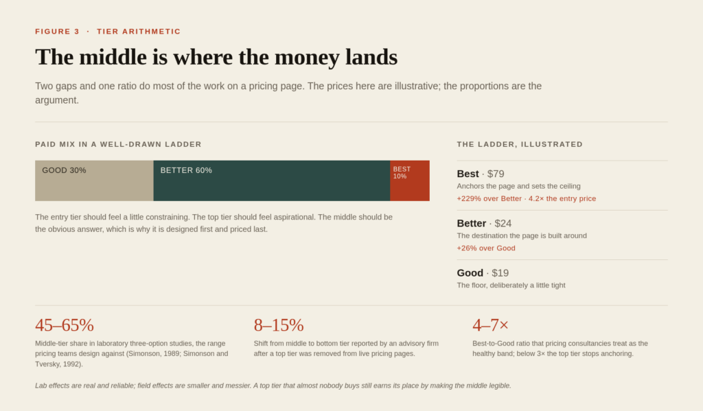
Practitioners quote a rough paid mix of 30/60/10 — three in ten on entry, six in ten on the middle, one in ten at the top. Treat it as a sanity check, not a law. It is published by subscription-billing vendors as a rule of thumb, and any number that tidy is a composite of many pricing pages stitched together.
The gaps do more work than the numbers
Here is the part that gets less attention than the anchor and matters more than the copy. Customers respond to the shape of the ladder, not the height of any rung.
A 2025 study by hy, a German pricing consultancy, with OMR Reviews — roughly 4,000 software reviews, 180 experts and 30 depth interviews — turned up three patterns worth stealing. Two-thirds of vendors ran three or four tiers rather than five. A small step between the two lower tiers, under about 30 percent, combined with a large step from middle to top, over 100 percent, produced the highest take rates in the middle. And leading with the most expensive plan, rather than burying it last, was associated with up to 10 percent more revenue — the anchor doing its work before the buyer forms a cheap reference.
Consultancies converge on a similar ratio between the top and entry price: somewhere around four to seven times, with three times as the point below which the top tier stops doing its job. That is designer arithmetic rather than revelation, but it is handy when you are staring at a page that refuses to sell the middle.
Where ladders break
Three failures account for most broken ladders.
The first is feature inflation at the bottom. A team answers a sales objection by adding to the cheap plan, and a year later the cheap plan contains everything the middle used to. The mix drifts down, revenue per account falls, and the repair hurts more than the original addition did, because taking features away annoys people more than never adding them did.
The second is the top tier as a skip. Every awkward request, every bespoke governance need, every one-off lands in the top plan until nobody — including your own sales team — can describe it in one sentence.
The third is the growth tier slotted between middle and top, which usually pulls share from the top rather than the middle. Advisory firms report that more than 60 percent of a new in-between tier’s mix arrives from the tier above it. You have not expanded the middle. You have discounted the top and called it segmentation.
There is a newer wrinkle too. A recent Journal of Consumer Research experiment with 601 preregistered participants found that shoppers who had just seen a dozen near-identical options inside each tier were markedly more likely to pick an extreme tier afterwards — 52 percent against 41 percent. Choice-set hygiene matters as much as price gaps. A tier with eleven flavours of the same thing is not a tier; it is a menu.
The playbook, in five moves
Draw the reference before you draw the number. Ask what the customer will compare this against when they arrive — a competitor, last season’s price, the plan above. Then design that. The number is the last decision, not the first.
Make the decoy buyable. If nobody could sanely purchase it, you are not clarifying a comparison, you are fabricating one, and the paperwork is now on the customer’s side.
Design the middle first and price it last. Write the middle tier as the answer to the most common job. Then price the top to make it look reasonable, and price the bottom to make it feel slightly tight.
Keep every claim inside the evidence. A reference price has to be a price. A 30-day low has to be thirty days. The moment an anchor needs a footnote to survive, it is a liability with a conversion rate attached.
Measure the feeling, not only the conversion. Architecture that lifts revenue per session and raises refunds, complaints and discount dependency is not a win, it is a loan against next year.
Where the psychology stops working
Three places, and honest pricing pages should say so.
Negotiated B2B deals, where one buyer, one scope and one procurement process make a three-tier page a starting bid rather than a choice set. Single-offer businesses, where there is nothing to compare and the anchor has to come from the market instead of your page. And categories where the buyer arrives already price-literate — regulated utilities, commodity electronics, anything a spreadsheet has already normalised.
The newest exception is the one most marketers have not priced in. When an AI assistant reads your page, it reads numbers, specs and reviews, not choreography. The crossed-out price is one field in a table. The decoy is a row with worse specs. If more of your discovery happens inside a chat window, the architecture buys you less, because there is no shelf left to furnish. What survives there is a clear product name, a legible difference between plans, and a price that does not need a story to look fair.
The takeaway
A price is a story told through architecture: the anchor frames what is reasonable, the decoy makes the target legible by contrast, the ladder sets the ceiling and captures the middle. Brands that design those three devices guide perception and protect margin. Brands that treat price as a raw number leave both to chance, and usually to the cheapest competitor on the shelf.
But the story only compounds while it is true. In a market where the 30-day low is printed next to the discount and a class action can be filed over a crossed-out figure, the honest architecture is the only durable one. Fabricated references convert once. Then they get audited, published, and read aloud in a courtroom.