Stop Adding Options. Start Designing the Choice.
Open the pricing page of almost any software company and you will find three plans. The middle one is highlighted, tagged “Most popular”, and pre-selected. Nobody on the growth team put it there by accident. Somewhere, someone ran a test, and a number moved.
That highlighted box is not a design detail. It is the closest thing to a steering wheel a marketer ever gets to hold. Conversion is rarely decided by what you offer. It is decided by how the offer is arranged: what is pre-selected, what sits first, what looks expensive next to what, how many doors you leave open, and how much friction sits on each one.
Most teams treat this as a late-stage optimisation task, something to A/B test after the product is finished. In practice the arrangement is already doing work long before the test is built. If nobody designed it, somebody defaulted it, and that default is quietly voting on your behalf, or against you.
The box nobody signed off on
Here is an uncomfortable exercise. Open your own checkout flow and count the decisions that were never actually decided.
The newsletter checkbox that ships pre-checked because a template did it in 2019. The annual plan that loads first because the pricing table inherited the order of the spreadsheet. The “recommended” badge applied by whoever wrote the copy. The upsell that appears after payment, when attention is lowest and momentum is highest.
None of these were choices your team made. They are choices your team inherited. And inherited architecture still steers behaviour: it just steers it without a rationale you can defend in a meeting, or in front of a regulator.
Choice architecture, the deliberate design of how options are framed, ordered, and defaulted, is the discipline that closes that gap. The most powerful instrument in it is also the least glamorous: the default.
What two decades of replication actually say
The default effect is the finding that people disproportionately stick with whatever option is already selected for them. It is one of the most heavily replicated results in behavioural science, and it has a number attached to it.
A meta-analysis by Jachimowicz, Duncan, Weber and Johnson pooled 58 studies covering 73,675 participants and put the average effect at d = 0.68, with a 95% confidence interval of 0.53 to 0.83. That is a large effect by the standards of social science. It is also an average, and averages hide the interesting part: the authors found substantial variation across studies, several null results, and two studies where the default pushed people the other way.
Two moderators explained much of that variance. Defaults work better in consumer domains than in environmental ones, and they work best when they operate through endorsement (“the company thinks this is the right choice for me”) or endowment (“this is simply how things are done here”). Both readings are flattering to the marketer and slightly uncomfortable for everyone else, because neither has much to do with the merits of the option itself.
Three mechanisms do most of the work. Effort: opting out requires a decision, a form, and a small amount of courage. Endorsement: the pre-selected option reads as advice. Status quo: changing something feels like a loss, even when the change is neutral on paper. Stack those three and you get the single most reliable conversion lever in the entire toolkit, one that never appears in a feature list.
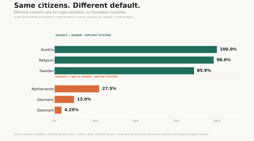
Two numbers make the point better than any framework.
In 2003, Johnson and Goldstein compared European countries with presumed consent against countries with explicit consent. In the presumed-consent countries, you have to register in order to refuse. Austria’s effective consent rate was 99.98%. Belgium’s was 98%. Sweden’s was 85.9%. In the explicit-consent countries, where you have to register in order to agree, Germany sat at 12%, the Netherlands at 27.5%, and Denmark at 4.25%. Six countries. Broadly comparable cultures. The gap between 99.98% and 4.25% is not a difference in generosity. It is a difference in paperwork.
The default is not neutral. It is an argument.
The second number is the one that should worry every product marketer.
Madrian and Shea studied a large US health-services company that switched its 401(k) from opt-in to automatic enrolment. Participation went from 49% to 86%. Nothing else changed. Same employees, same match, same fund menu.
Then came the part that matters more. Between 65% and 87% of newly enrolled employees started, and stayed, at the default contribution rate, invested entirely in the default fund. The default did not merely add savers. It wrote their savings rate.
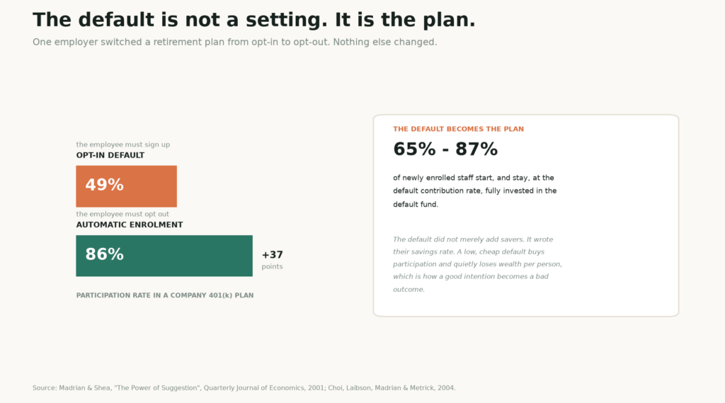
Read that carefully, because it is the most useful cautionary tale in this entire field. The employer picked a cheap default, 3%, and a conservative fund, because a cheap default maximises participation and minimises cost. Participation soared. Individual wealth accumulation did not, because the same lever that got people into the plan also pinned them at a rate too low to matter. The researchers found the effects roughly offsetting.
You are not choosing a default. You are choosing an outcome and calling it a setting. A default that serves the sign-up metric and quietly under-serves the person is not a neutral convenience. It is a decision, made on the customer’s behalf, and usually made without anyone in the room noticing they were making it.
This is why the ethics matter more than the tactics. Thaler and Sunstein argued that someone has to pick, so pick in the chooser’s interest and be transparent about it. That position is often mocked as soft paternalism. It is actually the only defensible position available, because the alternative is a silent paternalism that nobody audits.
Beyond the default: four more levers
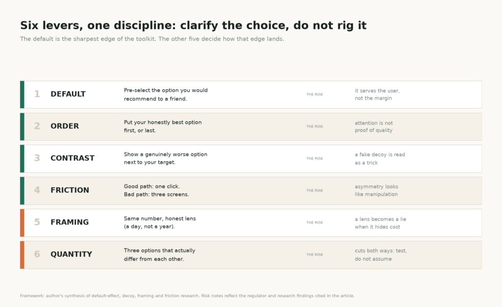
The default is the sharpest edge, not the whole knife. Four other instruments decide how that edge lands.
Order, and the second-order default
The first and last items in a list get disproportionate attention, which is why the position of your preferred option is itself an argument. A “recommended” badge placed on the middle tier is a default wearing a name tag: it is pre-selection by typography. Ordering is cheap to change and easy to defend, provided you can say out loud why that option deserves the position.
Contrast, and the honest decoy
Adding an asymmetrically dominated option, one that is clearly worse than your target but not obviously worse than the alternative, shifts choice toward the target. The finding dates to Huber, Payne and Puto in 1982 and became famous through Ariely’s subscription example. It is real, and it is also fragile: large multi-category replication attempts by Frederick, Lee and Baskin and by Yang and Lynn struggled to reproduce it, while a later domain replication with real stakes recovered a shift of about 16%.
The practical lesson is not “decoys work”. It is that contrast is a clarifying instrument, and it stops working the moment a customer recognises it as a prop. A decoy that reveals a genuine trade-off earns its place. A decoy that exists to make a bad option look acceptable is a trick, and people can smell it.
Friction, and the asymmetry test
You can make the good path one click and the bad path three screens. That is legitimate design. It becomes manipulation the moment the asymmetry runs the wrong way, when signing up takes one click and cancelling takes four pages, six clicks and fifteen options. That specific description is not invented: it comes from the Federal Trade Commission’s complaint against Amazon over Prime, and Amazon’s own internal name for the cancellation flow was “Iliad”, after Homer’s very long poem about a war.
Framing, and the honest lens
The same number reads differently through different lenses: per day rather than per year, 95% survival rather than 5% failure, cost per use rather than sticker price. Framing is not spin when the frame is true. It becomes spin when the frame is chosen because it hides something, and the test is simple: would you be comfortable if the customer computed the other lens themselves and put the two numbers side by side? If yes, frame away.
Quantity, with a warning attached
Fewer, clearer options usually convert better than exhaustive menus, and this is where the field’s most quoted study is also its weakest evidence.
The jam study everyone quotes, and the meta-analysis almost nobody does
In 2000, Iyengar and Lepper set up a tasting table in an upscale grocery store near Stanford. Some displays held 24 jams, others just 6. The big display was the better billboard: 60% of passers-by stopped, against 40% at the small table. The small table was the better shop: 30% of those shoppers bought a jar, against 3% at the big one. A tenfold gap in conversion, and a story so clean it has been repeated in roughly every marketing deck since.
Then, in 2010, Scheibehenne, Greifeneder and Todd did what almost nobody quoting the jam study has done: they tried to break it. Across 63 experimental conditions drawn from 50 published and unpublished experiments, with 5,036 participants, the mean effect of offering more options was d = 0.02, with a confidence interval from −0.09 to 0.13. Essentially zero.
That does not mean choice overload is a myth. It means choice overload is conditional, and the conditions are narrower than the folklore suggests. It bites when the chooser has no clear prior preference, when options are hard to compare, when the decision is effortful rather than enjoyable. It disappears, and can reverse, when people already know what they want or when browsing itself is the pleasure.
Which changes the practical instruction. “Cut your options” is not a conversion strategy. “Cut the options that don’t help anyone choose” is. If your three tiers differ in ways a customer cannot articulate, you have created decoration, not choice. If they differ on one dimension the customer actually cares about, three is plenty and two may be better.
Where the lever becomes a trap
The line is not subtle, though it is frequently blurred by people with a quarterly target.
The OECD’s 2022 report on dark commercial patterns defines them as business practices that use elements of digital choice architecture, particularly in online interfaces, to subvert or impair consumer autonomy, decision-making or choice. The definition is deliberately architectural rather than moral: it names the mechanism, not the intent. That matters, because the same mechanism produces both the helpful default and the trap.
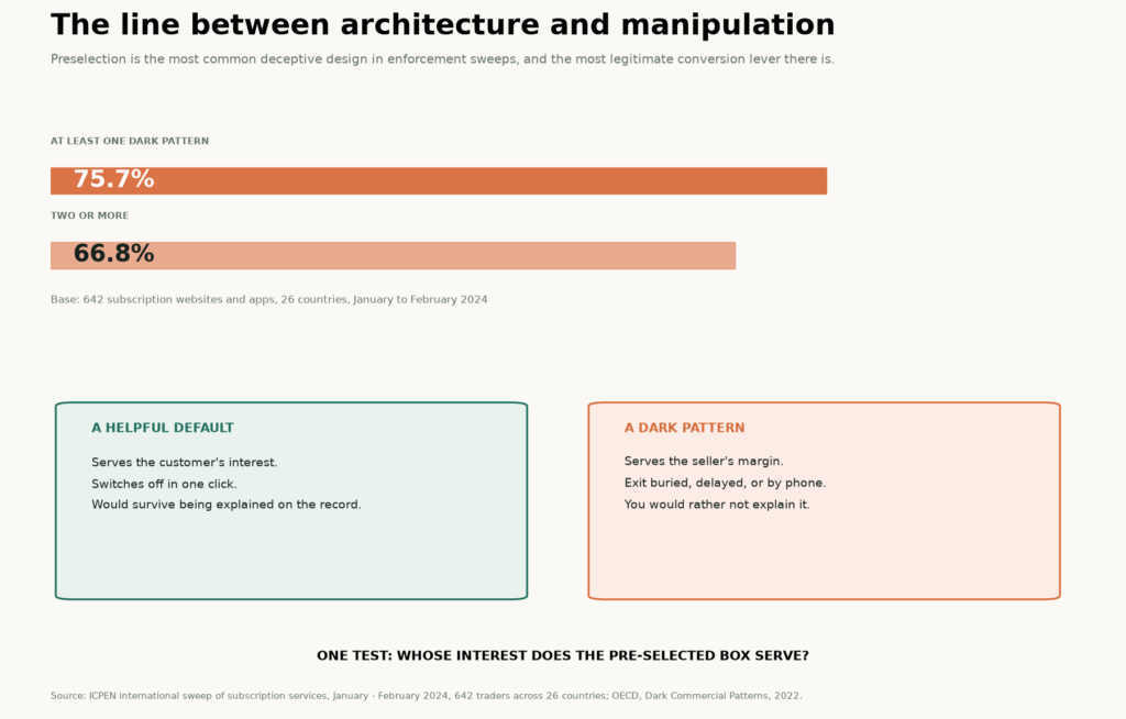
The distinguishing question is whose interest the pre-selected box serves. A default that reflects what a well-informed customer would choose is a service. A default that reflects what the seller needs this quarter is a cost, paid by someone who did not agree to it.
Prevalence data suggests the second version is common. An international sweep coordinated by ICPEN in early 2024 examined 642 subscription websites and apps across 26 countries and found that 75.7% used at least one dark pattern and 66.8% used two or more. Preselection and interface interference were among the most frequent findings. The single most effective conversion lever in marketing is also the single most common deceptive practice in commerce. Both statements are true at once, which is precisely why this topic needs judgement rather than a checklist.
The regulator is now reading your interface
For most of the last decade, “dark pattern” was a design-criticism term. As of late 2026, it is an enforcement category with a price list.
In the United States, the FTC’s 2024 rule requiring cancellation to be as easy as sign-up, widely known as click-to-cancel, was vacated in full by the Eighth Circuit on 8 July 2025 on procedural grounds. The rule died. The enforcement did not. The FTC reopened the rulemaking with an advance notice of proposed rulemaking in March 2026, while continuing case-by-case actions under the Restore Online Shoppers’ Confidence Act. In 2025 it settled with Amazon for a $1 billion civil penalty plus up to $1.5 billion in consumer redress, covering an estimated 35 million affected consumers, and the order does something unusual: it prescribes interface elements, including a clear option to decline Prime and a simplified cancellation path. The agency also noted that consumer complaints about negative option marketing had climbed to roughly 90 per day in 2025.
In Europe, the Digital Services Act bans interface design that deceives, manipulates, or materially distorts users’ ability to make free and informed decisions, and it names making termination harder than subscription as a suspect practice. In December 2025 the European Commission issued its first DSA non-compliance decision, fining X €120 million and finding, among other things, that the paid verification badge amounted to deceptive interface design. In the United Kingdom, the Digital Markets, Competition and Consumers Act 2024 gives the competition authority the power to fine up to 10% of global turnover for unfair commercial practices, with exit friction already treated as a high-certainty infringement.
The strategic implication is blunt. Your interface is now evidence. If your default cannot be explained in one sentence to a compliance team, it is not a clever growth tactic; it is an uninsured liability with a conversion lift attached.
A five-step audit you can run this week
None of this requires a redesign. It requires a reading of what you already shipped.
First, inventory the defaults nobody decided. Walk the funnel as a customer and write down every pre-selected state, every pre-checked box, every “recommended” label, every step that can be skipped and every step that cannot. Most teams find three or four items they cannot justify, and one of them is usually expensive for the customer and profitable for the company, which is the exact combination regulators look for.
Second, set the default for the customer’s best outcome, then check whether it aligns with yours. These two things do not always coincide, and where they diverge you have found either a product problem or an ethics problem. Choosing the customer-beneficial option and telling them why is not a concession. It is the only version of this lever that survives contact with a renewal cycle.
Third, use order and contrast to clarify, not to camouflage. If a customer, seeing your three tiers arranged exactly as they are, could explain the trade-off to a friend, the architecture is doing its job. If the arrangement only works because the middle option is highlighted, you are renting attention you will have to pay back at churn.
Fourth, reduce friction on the right path, and only there. One-click upgrades, sensible pre-filled fields, a saved payment method: all fine. A cancellation flow that requires a phone call while sign-up took one click: not fine, and increasingly expensive. The symmetry test is the whole rule. Can they leave the way they came in?
Fifth, measure trust next to conversion. This is where choice architecture programmes usually fail, not ethically but analytically. A manipulative default lifts the conversion rate and degrades the things nobody puts on the dashboard: refund rate, complaint volume, cancellation reason codes, 90-day repeat purchase, and the share of customers who say they were surprised by what they bought. Track all five for one quarter and the net effect of your cleverest default becomes visible. Sometimes it is still positive. Often it is not, and you will only know if you looked.
The default is about to get a co-signer
One structural change makes this more urgent than it was two years ago. Increasingly, the first pass over a purchase is made by a model, not a person: an assistant that drafts a shortlist, a recommender that proposes a plan, an agent that pre-fills a basket. Those systems inherit the same architecture. A pre-selected option that was once a nudge aimed at a human is now a template handed to a machine that has no reason to question it.
The consequence is uncomfortable for anyone who built a career on exploiting inattention. Attention is being delegated, and defaults are being read by software that does exactly what it is told. Architecture that only works by catching people off guard is about to stop working, while architecture that reflects a genuine recommendation becomes more valuable, because it is the version a model can safely repeat.
What to take away
Choice architecture is the quiet lever that moves a decision before the customer forms a preference, and the default is its sharpest edge. The evidence for it is strong and well quantified, and the honest version of that evidence includes the variance, the null results, and the 401(k) case where a cheap default bought participation and lost wealth.
So audit the choices you never made. Set defaults you would defend to the person they apply to. Use order, contrast, friction and framing to make the real trade-off visible rather than to bury it. Measure what the lift costs in trust. And remember the one test that covers all six levers at once: whose interest does the pre-selected box serve, and would you be comfortable saying so out loud?
Architecture that passes that test compounds. Architecture that fails it converts beautifully, right up until the renewal, the complaint, or the letter from a regulator.